9 5. Paleographical considerations
The main features of the scribe's palaeographical repertoire are collated into the Palaeographical profile section, which summarises minuscules, majuscules and Litterae nobiliores, or more noticeable letters. In this section, I follow the terminology in Parkes 1969.
1 5.1. Palaeographic profiles
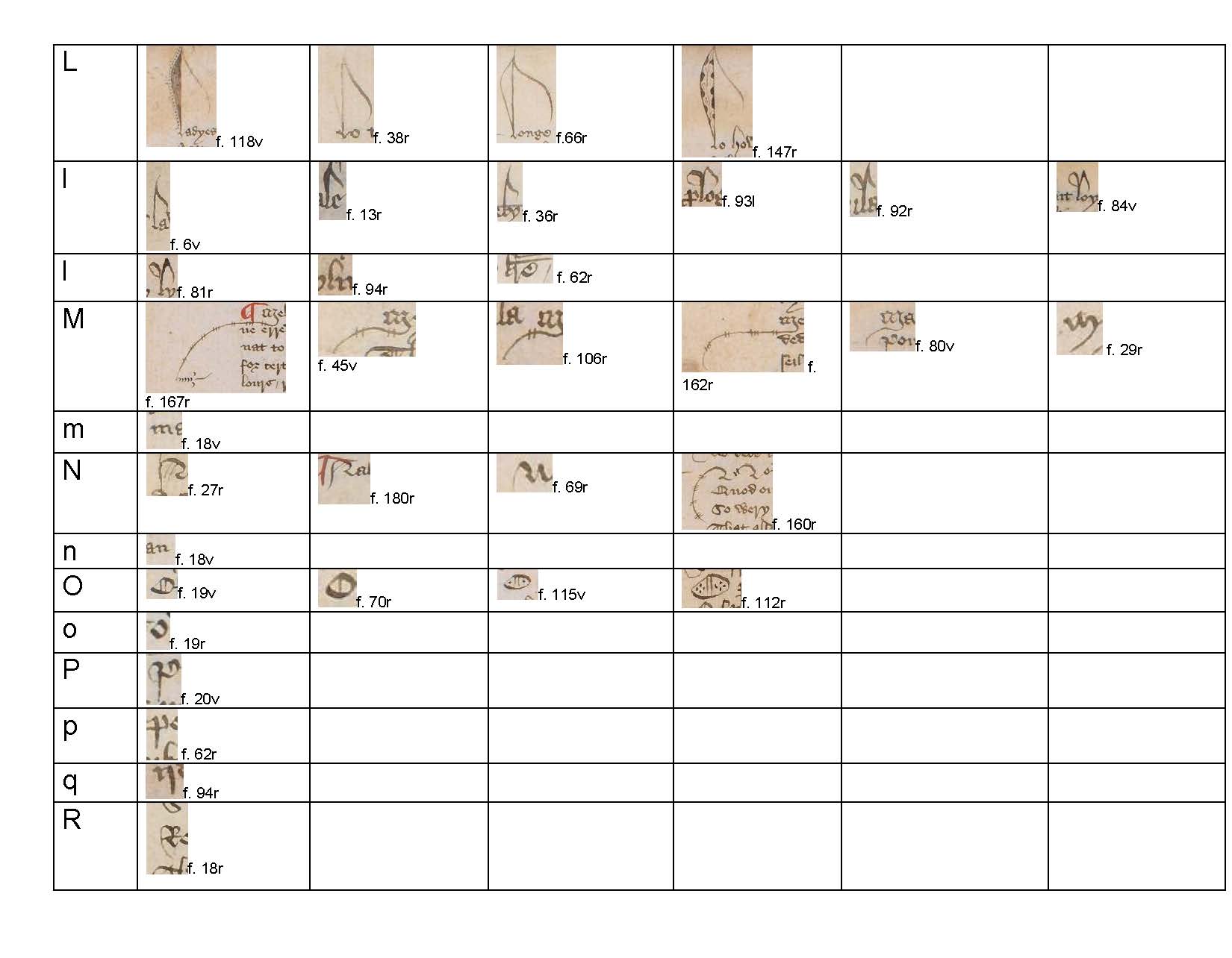
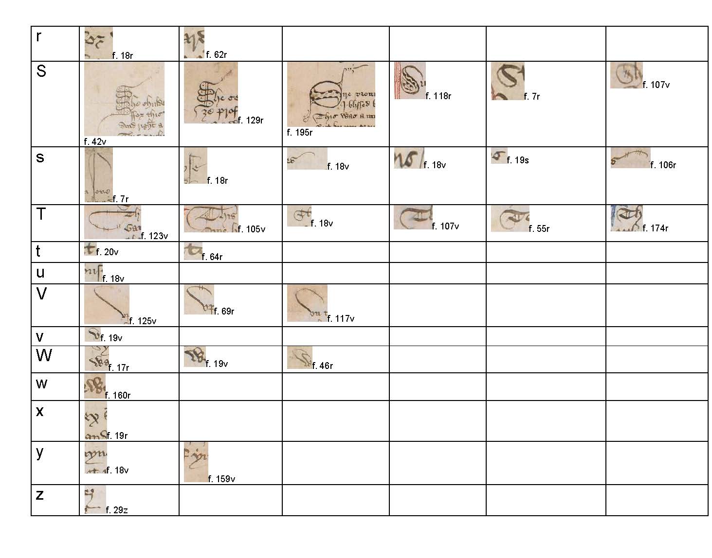
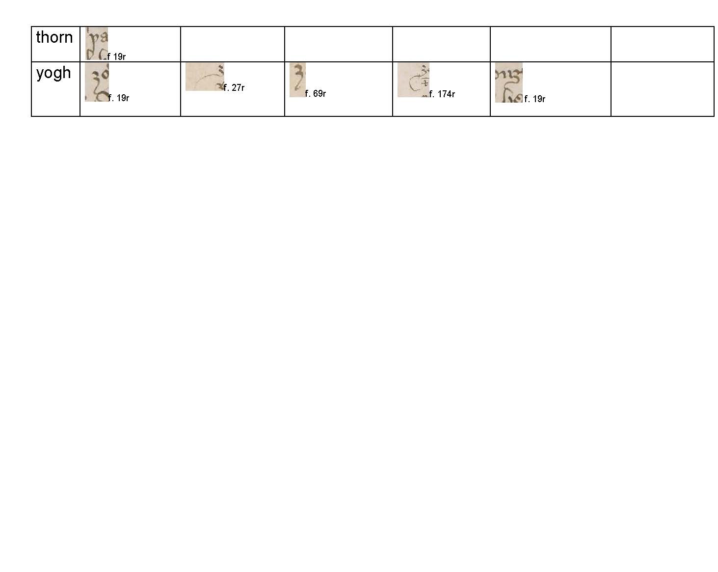
The Palaeographic profile contains a selection of minuscules, majuscules and litterae notabiliores taken from the scribe's repertoire. The capitalization in the headings reflects the type of letter gathered in each individual profile.
Profile A a
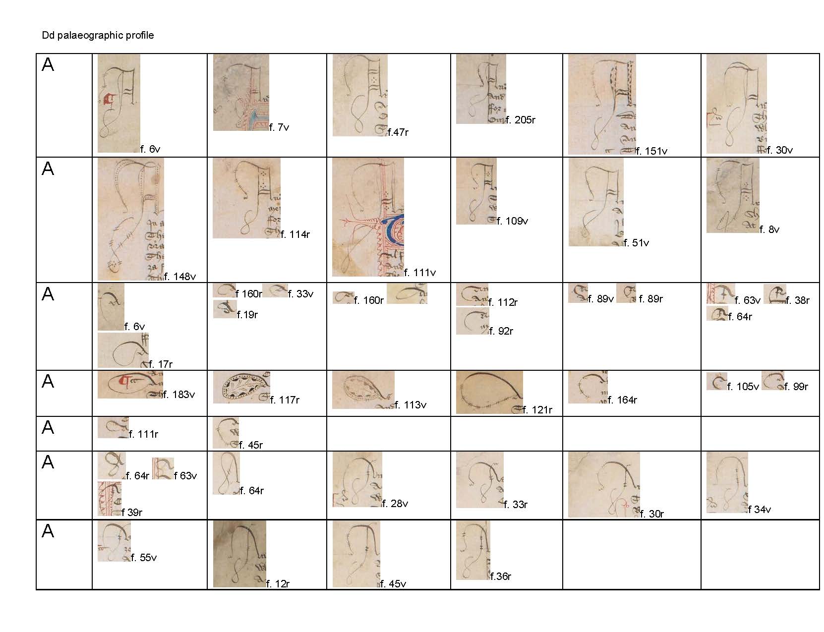
Profile A a to E
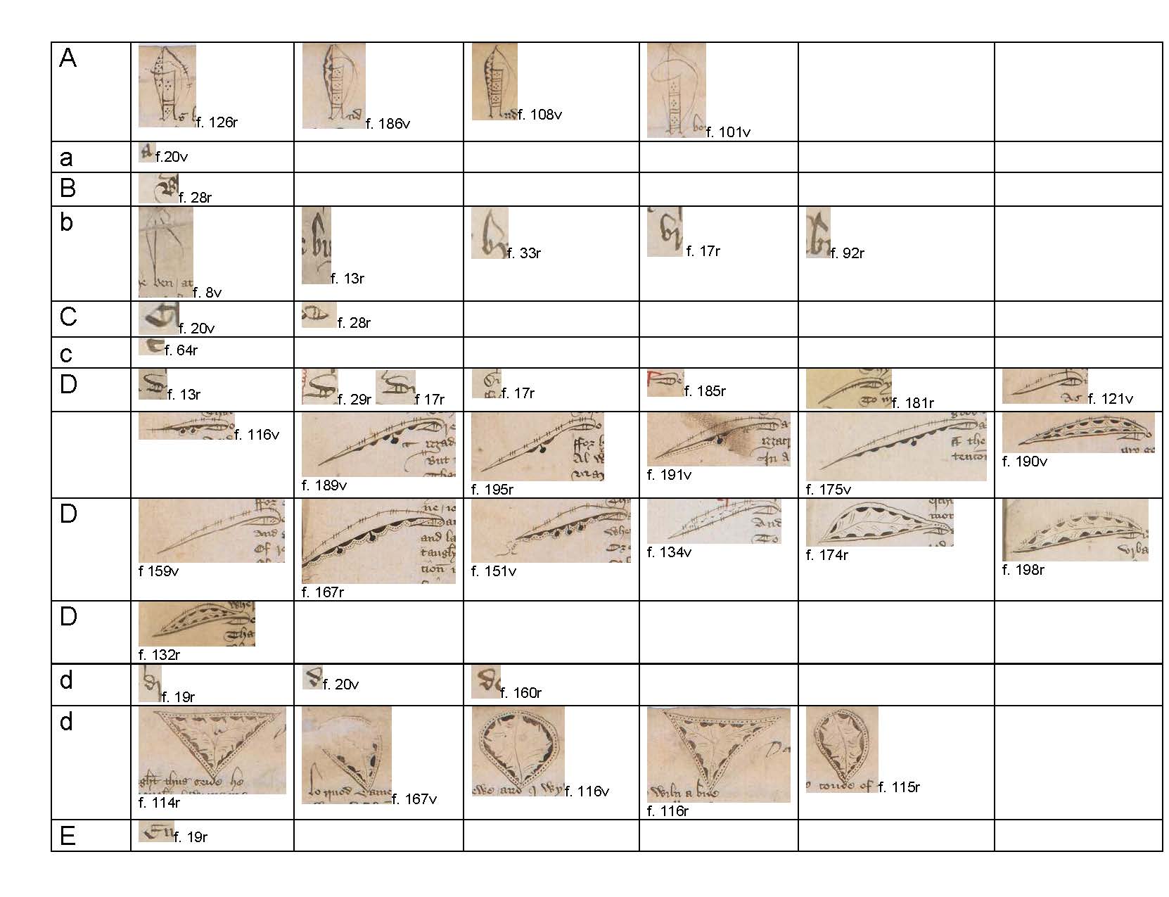
Profile e to H
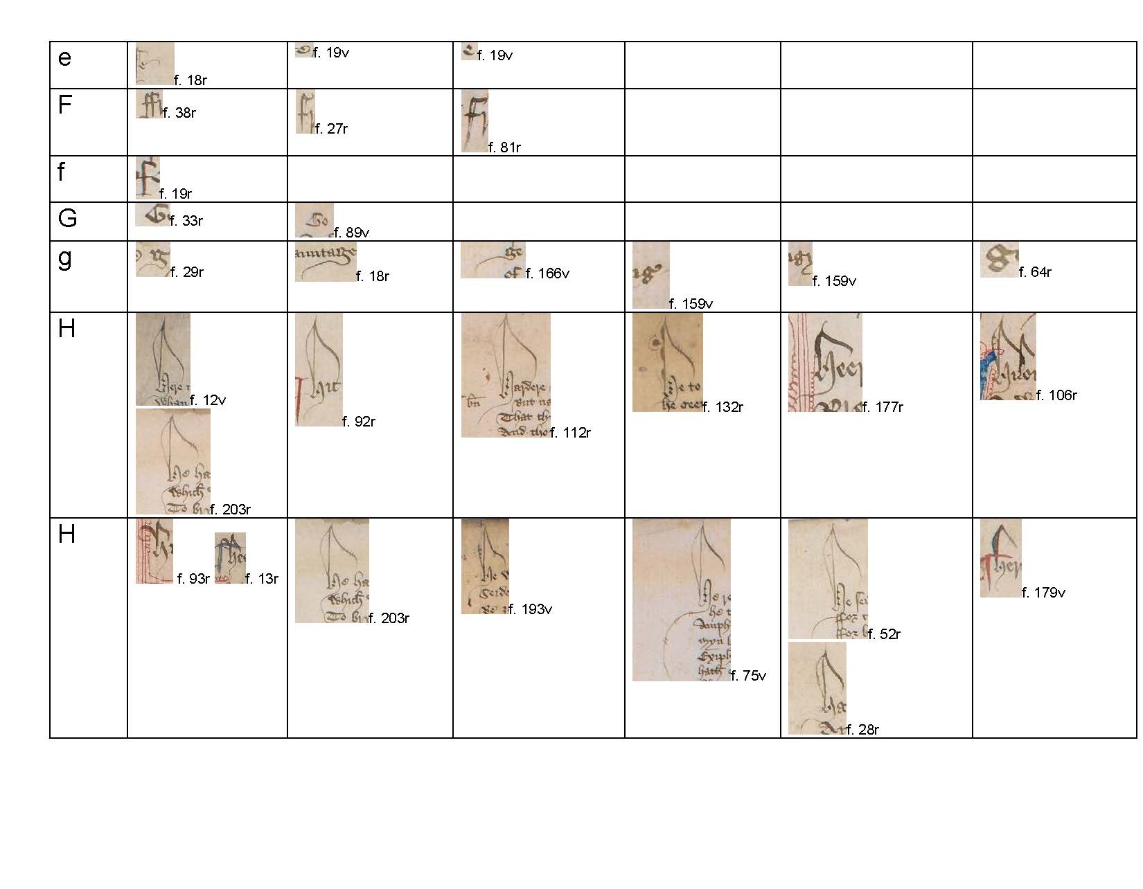
Profile h to k
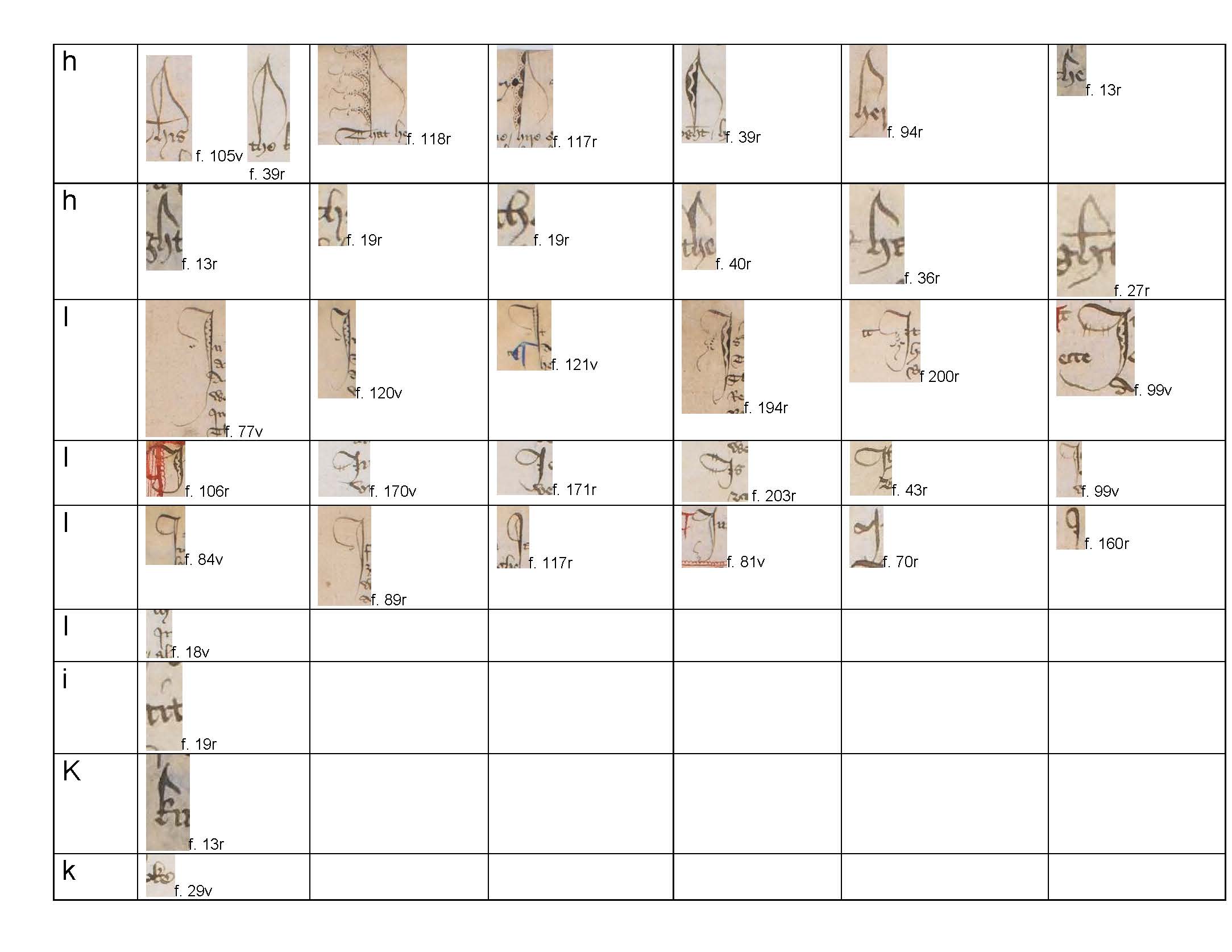
Profile L to R
Profile r to Z
Profile thorn and yogh
2 5.2. Description of the hand
All the text, incipits and explicits, glosses and corrections are written by one hand. The hand shows a certain degree of uniformity; it is an anglicana formata, influenced occasionally by bastard anglicana (Parkes 1969, pp. xvi-viii). The bastard anglicana is mainly used in incipits and explicits. Overall the ductus, or the order and direction of the traces which form the basic shape of the letters, gives the impression of a cursive hand with extremely upright ascenders and descenders which extend far above or below the line of writing. The script also displays a certain degree of calligraphic sophistication especially in the execution of the litterae notabiliores and the use of otiose strokes. In particular, the decenders of g (fol. 29r; fol. 18r), of y (fol. 18v) and of the limb of h (fol.19r; fol. 40r) have been prolonged into hairlines. Otiose hairlines are also present at the foot of the stem of the 2-shaped r(fol. 62r) and on the descender of yogh (fol. 18v).
The handwriting retains the main features of the anglicana form (Parkes 1969, pp. xiv-vi). The a is a two-compartment letter, however, the upper lobe of a does not extend above the level of the other letters. The d has a looped ascender, which is traced with a broken stroke from the left to the right; the descenders of f and long s extend below the line of writing and curve to the left. The ascenders of b, h and l curve on the right in a pronounced hook. However, the appearance of the handwriting is an engrossed form of the script. The body of the letter forms is larger, but generally does not exceed 2 mm in height; with this size of handwriting the upper lobe of a and the short s do not extend above the level of the other letters. The lobes of d, b and g have a more squarish proportion. The letters d and g especially recall the textura shape. The minims of m, n, u and i are traced separately and easily distinguishable, but they are slightly bent on the left, probably to achieve speed in the process of writing. The head and the foot of each minim curl to form a serif. The i is marked with a diacritic stroke to avoid confusion with other letters. Not only is u distinguishable through context, but also the scribe avoids tracing a serif on the head of the second minim, so that the two strokes appear to be separated. Minuscule g is a two compartment letter shaped as an “8”. However, the descender of g is not always closed in a lobe, but it remains open and prolonged in an otiose hairline, a g which reminds one of the form usually found in the textura prescissa. This can be noticed in initial and final positions in words which appear at the end of the line.
The scribe adopts the long forked form of r as a rule, but he always uses the 2-shaped r in conjunction with o. He uses three forms of s. Long-s is used medially, hardly ever initially. When it appears, it is formed with two strokes; a long broad one and a thinner one attached to the foot and the hooked head (fol. 29r KN 1342 sat; 1375 sore). Sigma-shaped small s is regularly employed as an initial letter and frequently in final position. In final position, it alternates with a small s (8-shaped), which is diamond-shaped with a small tail or serif attached as an extension on the upper curve.
The scribe uses the round form of e in final position, alternating it with an open e, whose head is prolonged with a tongue. v and u are used interchangeably, although v occurs more frequently in initial position. Small y is not regularly dotted; it is not always clear the reason why the dot appears. In Aberystwyth, National Library of Wales MS. Peniarth 392 D (Hengwrt), the dot is used to distinguish y from þ (Doyle and Parkes 1979, p. xxxvi and see also the use of dotted y by Hoccleve, in Burrow and Doyle 2002, p. xxxv). In Dd, the dot seems to indicate a capital form of y, although this is not regularly employed by the scribe (see, for example, fols. 33r, 142r, 143r and 146v). Crosses h and crossed ll is also used. Crossed h may or may not indicate an abbreviation, whereas crossed l is always used to abbreviate 'lettre' as 'lre' (fol. 62r).
þ is used frequently. ? is employed both in initial and median position. The scribe adopts the same form of ? for z, however, he forms the descender with a downward stroke turning right.
The distinction between capital and lower letters is not always clear. Majuscules occur at the beginning of the line and occasionally in the text, although it would be perhaps more appropriate to call them litterae nobiliores (Parkes 1992, pp. 25-27). In the scribe’s repertoire, there are distinctive capitals forms, often emphasised by calligraphic sophistication. A is the most heavily represented, and there are several different letter forms. An expansive A with a square head made by several broken strokes, which is prolonged on the left in otiose decorated hairline strokes. The left enlarged ascender is decorated with a downward stroke which turns up and curls on itself again counter-clockwise. This letter can be decorated with several sophisticated interlaced strokes, dots or other pen-work (fols. 6v, 151v and 148v). There is also an expansive A with a sweeping deep downwards stroke turning upwards counter-clockwise across itself as it turns clockwise, with decorative barbed wire-like strokes (fols. 28v and 64r). Another expansive A is made with two distinctive and elegant curves, open at the bottom and decorated with oblique straight strokes, the left stroke usually continuing with a simple curve. At times the scribe modifies the two compartment anglicana a, exaggerating the upper loop and decorating it with leaf motifs or barbed wire strokes (fols. 6v, 92r, 117r and 121r).
The main characteristic of litterae nobiliores is the use of two vertical strokes to decorate the lobes of capital D, E, N, O, P and T. In the profile of the scribe, there are also frequent uses of display letters as capitals H, I, L, M, S, V, although w and W are only distinguishable through size. The preferred form of S is a larger version of sigma-shaped small s. There is also one example of a rounded capital D (fol. 17r). Forked L/l (fols. 81r and 92r) and H (fols. 93r and 13r) are used for calligraphic effect in incipits and explicits.
Although the size of the hand is regular throughout the manuscript (no more than 2mm), the scribe crams lines occasionally at the end of folios, hence the aspect of the hand changes due to the reduced size of the spacing between the lines of writing and the size of the hand (see, for example, fol. 46r).
This hand is remarkably similar to New York, Pierpont Morgan Library, MS M 818, a copy of the A version of Piers Plowman, which is written on paper with parchment guards in the inner and outer quire. The manuscript is dated to the mid fifteenth century by Kane (1960).
2 5.3. Abbreviations
The scribe is familiar with the rules of abbreviation and many common contractions are found: macron, superscript letters and brevigraphs (Cappelli 1990). He regularly abbreviates 'that', 'with' and 'and'.
3 5.4. Punctuation
Litterae notabiliores dominate the beginning of almost every line of verse. The virgula suspensiva marks the medial pause of the line. In TM, the only prose text in the manuscript, the ‘double virgule’ marks the insertion of a subsequent paraph in blue or in red by the rubricator. Punctus is rare (fols. 8r and 17v); it is used sometimes in conjunction (fol. 18v) or to substitute (fols. 6v and 79r) the virgula, mainly around numbers (fol. 51v) and once in the prose (fol. 161v). Punctus elevatus generally appear in incipits and explicits (fols. 55r and 54r) and glosses. The scribe also employs a hyphen and a wavy line filler with semicolon as the end mark in the glosses. On punctuation in the Canterbury Tales see: Blake 2000, Killough 1982 and Solopova 2001.
The scribe marked the places for the paraph marks to be inserted by the rubricator in three different manners:
1. A small ‘cc’ symbol;
2. An elaborate ‘cc’ symbol: the tail of the last c extends over the letters forming a loop and descending on the opposed side in a prolonged otiose hairline;
3. A ‘double virgule’ in prose.
Type 2 resembles the ‘tremolo stroke with knot’ found in Hengwrt, which Doyle and Parkes (1979) suggested: ‘may incorporate an “end-of-section” mark (positura)’ (p. xxxviii, see also Stubbs 2000). The mark is also frequent in several administrative and legal documents. Paraph marks and symbols can appear in the text in different combinations:
1. Paraph and elaborate ‘cc’ symbol, for example, fol. 39r;
2. Paraph and small ‘cc’ symbol, for example, fol. 76v;
3. Paraph written over ‘cc’ symbol, for example, fol. 99v;
4. Paraph written over two strokes in the prose only, for example, fol. 161r;
5. Small ‘cc’ symbol alone, for example, fol. 138r.
4 5.5. Decoration
No illuminated letters appear in the manuscript. Ornamental capitals in blue with penwork flourishing in red ink as decoration mark the first line of tales and links or other textual parts which the scribe indented. A small capital appears, at times still visible (fol. 13r), in the indented space as a guide for the limner. The size of the capitals changes according to the type of textual part which the Lombard capital introduces.
Paraph marks in the text are mainly in red, sometimes in blue; they mark incipits, explicits, glosses, other parts of the text and every stanza in stanzaic tales, for instance PR. The execution of the paraph by the rubricator differs. There are examples with a squarish head at the top and a straight back and others with a more rounded head and straight back. Two parallel lines in blue and red are sometimes used to mark the glosses, extending over all the lines of the gloss on the left side. In eight occurrences the sign and the paraph have been erased: fol. 43v MI 322, MI 336; fol. 45v MI 528; fol. 46v partially on MI 559; fol. 165v TM 226; fol. 166v TM 276; fol. 171v TM 572; fol. 192r in the marginal gloss. On the significance of paraph in the manuscripts of the The Canterbury Tales, see Fredell 2000.
As explained above, calligraphic effect is achieved with the frequent use of litterae notabiliores, usually, but not exclusively capital letters. This style is mainly used in top or display lines, in which the scribe demonstrates accomplished skills in his penwork decorations. The palaeographical profile shows the main instances of this scribal feature in Dd. For example, the ascenders of h and l are enlarged and decorated with a loop on the left and a counter stroke on the right; variations of this appear throughout the manuscript. These display letters are numerous and appear both at the beginning of a word and in the middle. The display letter d, for instance, is decorated differently whether it appears at the beginning of the top or median lines. Top lines are decorated with leaf motifs but when an emphatic letter appears at the beginning of the line, the exaggerated ascender curves to the left and is decorated with barbed-wire like strokes.
These ‘decorative conventions’ are ‘well established in documents and books’ (Doyle and Parkes 1979, p. xxxix) of the period, and demonstrate the permeability of writing environments. That is, scribes trained to copy documents could be easily employed to copy books. Indeed, examples of these types of decorations can be found in Corporation of London Records Office, Letter Book 1, fol. 29, the Founding of the Stationers’ Company, 12 July 1403 (mainly letter I and M), London, Guildhall MS 05370, London, Corporation of London Record Office, Bridge House Accounts 1404-21, fol. 3. For the Bridge House Accounts (see also Christianson 1987). In the National Archives, several other examples survive with similar features, see for example, E 266/24/35, E 266/21/32, E 266/21/15 and E 266/20/20.
1 8.4.1. Ornamental capitals
Folio Marked part of the text Size
6r-10v GP-Each Pilgrim 1 cm
13r KN-The opening line 1.5 cm
29r KN L1363 1.5 cm
29v KN L1413 1 cm
30r KN L1439 1 cm
30v KN L1515 1 cm
32r KN L1625 1 cm
35r KN L1883-Third part in Hg 1 cm
39r L1 2.5 cm
40r MI 2.5 cm
47v L2 2 cm
48r RE 1.5 cm
52v L3 2.5 cm
53r CO 2.5 cm
54r L7 2 cm
55r ML 3 cm
58r ML L288-Second part 1.5 cm
63v ML L778-Third part 1.5 cm
67r WBP 2 cm
71v WBP L379 1.5 cm
76v WB 4 cm
81r L10 2 cm
81v FR 2 cm
85v L11 2 cm
86r SU 2 cm
92v CL 2 cm
93r CL-Tale 2 cm
105r L13 1.5 cm
106r L15 2 cm
106r ME 2 cm
111v ME L465 1.5 cm
119r L17 2 cm
119v SQ 2 cm
138v PH 1.5 cm
142r PD 1.5 cm
144r PD-Fabula 3 cm
149r PD L591 2 cm
150v SH 3 cm
156r L22 2 cm
160v TM 2 cm
177r L 29 2 cm
178v MO 3 cm
187v L30 2.5 cm
195v L31 2.5 cm
202r L33 2 cm
204r CY 2 cm
6 5.6. Corrections
The text was thoroughly revised. Corrections appear in tales, links and glosses (fols. 97r, 105r and 121v). The scribe emended by erasure and expunction (mainly underdotting and horizontal strokes). The emendations are usually inserted with carat marks either in the margin or in interlinear position. Occasionally, they are written immediately after the correction on the same line or over the erasure. Corrections were made in three different shades of ink: the brown ink used for the text and the majority of corrections; the dark brown, almost black, ink used in three different instances; and a yellowish ink used rarely. A full collation and discussion of the corrections in Dd appeared in Da Rold (2007a).
7 5.7. Annotations
Glosses are written in the same script as the main text. Either they provide support for the text, explaining where references come from, or they represent assertion of agreement or dissent, commenting not only on the text, but also on its versification: e.g. fol. 204r. Comments on the textual nature of the glosses can be found in Partridge (1998) and of a more general kind in Blake (1985). Kennedy, instead, focused on the misogynistic significance of some of the annotations (1997, pp. 30-4 and 1999, pp. 213-6). A transcript of the glosses is included in this edition.
Later annotations, particularly of names which may relate to later ownership, also appear in Dd: Hungerford (fol. 8r); Rychard Mervyn (fol. 38r); Rokes (fol. 120v); William (fol. 121r); Wyllyam Langtun (fol. 146r); Wylliam Pully (fol. 150r); William Rokes (fol. 180r). Manly and Rickert used these names to trace the history of the manuscript (1940, 1, p. 104) which is reconsidered by Mosser (2011). Other later annotations include the insertion of headings or of nota marks, in particular in ME.
9 5.8. Date
The manuscript has no colophon. Manly and Rickert (1940, 1, p. 101) dated Dd 1400-20. Mosser (2011) confirms Manly and Rickert’s date: 1401-1420. Seymour suggested an even later date ‘c. 1420, even later’ (Seymour 1997, p. 46). However, the handwriting of the scribe seems to have earlier features, such as the rounded D and the forked L and H. In the catalogue of the manuscripts of CUL, there appears a note indicating that the hand of the scribe could be dated “to the close of the xivth century” (Luard 1856, 1, p. 228).
However, the manuscript could have been made between the end of the fourteenth and the beginning of the fifteenth century. I am reluctant at this stage to offer a more specific dating for Dd. What can be said from the evidence of the handwriting and the paper-stock is that the manuscript could have been in the making between 1390 and 1416. This assessment expands the dating offered by Manly and Rickert who firmly believe that no manuscripts of the Canterbury Tales are in vita productions (Da Rold 2010). Regarding Dd, the use of paper in this manuscript cannot be regarded as evidence of a fifteenth-century production, I have argued elsewhere that paper is also used in considerable quantities during the fourteenth century (Da Rold 2011).
10 5.9. The scribe
The name “Wytton” appears in Dd on fols. 39r, 47r,63r and 92r. This name may be that of the scribe who copied the manuscript. It has been claimed that he was an amateur making a book for himself and that the text was carelessly written. Manly and Rickert suggest that he could be a Richard Wytton master at Mickle Hall in Oxford, and linked with Walter Hungerford (Hungerford appears in Dd on fol. 38r), who knew Thomas Chaucer and could have provided the exemplar for Dd (Manly and Rickert 1940, 1, p. 105). This suggestion is supported by Ramsey (1994, pp. 401-2), who suggested that most probably Wytton was not making this copy for himself, but for Hungerford. This may explain the piecemeal reception of the text and the good textual quality of the copytext of Dd. Mosser (2000) rejects this opinion on linguistic grounds. He identified him with a Robert de Wytton, a Cambridge student, who at the end of the fourteenth century acted as vicar general to the bishop of London and then became rector of St. Mary in the Marsh, Kent (Emden (1963, 663-4). After the influential work of Manly and Rickert, in particular, Dd has long been considered an amateurish production of provincial origin (Dempster 1946, p. 408 and Hanna 1995, p. 230). These suggestions, however, do not fit well with the evidence put forward in this study.
Dd is written in a neat and regular anglicana hand with clear and distinctive clerical features which can be found in books and records of the end of the fourteenth century and beginning of the fifteenth century. The scribe can control his writing well in both the text and the marginalia. He also copies the incipits and explicits of the text in a different type of display script, thus he must have been trained, as many scribes were, in the art of writing multiple scripts (on training, see Steinberg 1941, de Hamel 1992, p. 38, Parkes 1969 and Bischoff 1990, pp. 28-47).
The scribe demonstrates acquired skills, probably derived from training, also in organising the quires and the manuscript overall. He used sheets of a large size that he folded into quarto, which he arranged in quires of five with two parchment bifolia inside and outside the quire. This organisation of the quires had potential disadvantages if the manuscript was not copied from beginning to end. It is not likely that the quires were assembled in a straightforward way. The difficulties that the scribe encountered in ordering Dd and the use of this format for the manuscript are signs that the scribe was taught how to assemble a book. The scribe is a skilful copyist, although of course he makes mistakes (Da Rold 2007a).
What distinguishes a professional scribe from an amateur is not always clear. Jenkinson (1927, pp. 30-2) distinguishes between clerks, public scriveners, notaries, lettered laymen and writers of the special hands. This distinction is based upon the type of training and education they had. Bühler (1960) recognises that anyone who could write could potentially produce manuscripts, and he divides these people into three categories: professional, amateur and semi-professional. The first includes those scribes who are copying for the public and produced very fine manuscripts. The second includes those who are not professional scribes, but are copying for themselves or for others. University students who transcribe manuscripts to support themselves make up the third category. Among the professional scribes, Bühler (1960, pp. 20-4) also includes writers who earn their living by their work through employment in court, government offices and as public clerks. Christianson has focused his research on the London book trade outside the court and other public offices. These writers are ‘most often laity and frequently educated as apprentices, who were self-employed or worked for hire as independent literati’ (Christianson 1984, p. 144). He found evidence of a flourishing book trade concentrated in particular in the area of St. Paul's (Christianson 1989, 1989a).
These typologies of scribes give a snapshot of some of the writing environments in late medieval Britain. But the question remains: where was Dd written? If the scribe is identified with the Wytton that Manly and Rickert suggested, the manuscript must have been copied in Oxford. Dd does not exhibit any of the characteristics associated with the university town, the number of leaves per quire, the size of the manuscript or its general make-up (Watson 1984). Dd's language as indicated by Mosser does not favour a scribe working in Oxford. Wytton's spelling system has recognisable London features, which indicate that the scribe worked in London, unless he was trained there and lived elsewhere (Thaisen and Da Rold 2009). Manly and Rickert (1940, 1, p. 102) claimed that Dd shows ‘no pronounced variation from the language of Hg and El’. This may indicate a similar exemplar, and a scribe without a pronounced dialectal influence in his spelling system, presumably because he was working in the same area as the scribe who copied Hg and El. Codicological and textual evidence suggests that the Dd scribe received his material at different times and therefore he must have been well-connected to a network of other scribes who could readily supply the material he needed to carry out his job. The material from which Dd was copied is not a complete manuscript and it is reasonable to believe that the Dd scribe operated within a short distance of the supplier.
The palaeographical evidence of Dd suggests that Wytton, if this indeed is the scribe’s name, was most probably a clerk working in the London-Westminster area. As yet, his hand has not been identified, but he could have been working in a government office or within any of the City’s writing environments. The recent discovery of Adam Pinkhurst (Mooney 2006) as scribe B and working for the London guilds offers an additional scenario for the identification of Wytton amongst those scribes. Wytton was a popular surname in London. In Letter Book I, a certain Thomas Wytton lived next door to John Marchaunt (Scribe D) in the Guildhall Close (Estelle Stubbs, private communication), and Stubbs has already suggested that a certain Thomas Wycton was John Prophete’s Chamberlain (Stubbs 2000). One may not be certain that the Thomas Wycton, chamberlain of John Prophete, is the scribe who copied Dd until samples of the same handwriting are found. However, there is another hint that may connect Prophete's circle with Dd. Among the scribes who were working with him is a Robert Frye, who is said to be from Wiltshire, where it is said he retired and died in 1435 (Brown 1971, pp. 272-3). The Hungerford family belonged to the Wiltshire gentry and both Lord Hungerford and his father were sheriffs for the area and represented the shire in parliament (Kirby 1994, pp. xv-vii). A connection between Hungerford, Frye and/or other scribes in the Privy Seal or the city guilds is possible by virtue of common interests in political issues, which may explain how Dd was owned by the family at an early stage. Whether Dd was copied for a member of the Hungerford family or not is impossible to say.
It is plausible that the Dd scribe was collaborating with other scribes and that he was involved in the network of the London manuscript production which was so famously described in Doyle and Parkes’ seminal work (Doyle and Parkes 1978) and has recently been investigated by Linne Mooney, Estelle Stubbs and Simon Horobin in the ‘Late Medieval Scribes‘ Project.